Short, direct, comprehensive: what characteristics a CTA must have in order to be effective
"Click here", "Find out more", "Buy now": these are just some of the most common Call to Actions, or CTAs, used in content marketing, which today we find within any type of communication: from newsletters to social media, from TV to billboards.
We are talking about a portion of content that is as small as it is decisive within a message, due to its exhortative power and incredible ability to catalyse the users’ interest.
Building effective CTAs takes time, study and the ability to analyse the results. Why? We will go through it in this article.
What is a Call To Action
First of all, let's define what a Call to Action is. It is a textual or graphic element (it can be a button, but also a banner or a short phrase within a text) addressed directly to the user and containing a link to a specific page.
The aim is to induce the reader to take an immediate action: sign up to a form, download a file, visit the website, make a purchase, etc.

How to Create a great CTA
Choosing the right CTA is neither simple nor obvious.
The first step is to set your goal. Do you want to sell a product? Do you want people to read an article? Do you want them to register on your website? Depending on your final goal, you will create the call to action. There is more.
There are several elements - first and foremost the writing and design - that contribute to the creation of an attractive Call to Action, capable of capturing the user's attention immediately. In particular, a good CTA should be:
- short, direct: it is preferable that it does not exceed 4-5 words and that those few terms are keywords, which lead the user to act immediately. The verb tense is fundamental in these cases: the imperative is the most suitable because it expresses an idea of immediacy, of an action that cannot remain unfinished. The choice of language is also important: it is essential to use terms that are easy for everyone to understand, thus avoiding technicalities or complex vocabulary;
- exhaustive: those few words used must be rich in meaning. A formula such as CLICK HERE could sometimes be too vague, while SUBSCRIBE NOW or BUY NOW already encapsulate the action you want the reader to perform (sign up in one case and buy in the second) and are therefore more direct and unequivocal: they do not need additional information to be explained;
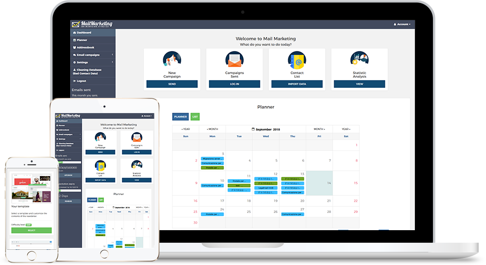
- well positioned: in order to stand out, the CTA must occupy a central position in the newsletter. On Mail Marketing you will find many predefined templates in which the button is highlighted thanks to its position apart from the rest of the text. Our advice is to leave some white space around the button so that it does not blend in with the rest of the newsletter;
- coloured: another feature that would contribute to the foregrounding of the cta is colour. Choosing bright colours that are clearly different from the other components of the newsletter ensures that the call to action is clearly visible and does not get confused with any other textual/graphic element. If the call to action is not a button but a short sentence in the text, other measures such as underlining and the use of bold type can be used to make it stand out from the rest.
- must convey a sense of urgency: a technique often used in marketing is that of 'scarcity', i.e. emphasising the brevity of the offer or the limited quantity of products available, in order to make the proposal even more irresistible. Formulas such as "REQUEST WITHIN 24 HOURS", "BUY WITHIN TODAY" or even the use of adverbs such as NOW and NOW - within the CTA - have an excellent chance of success because they invite people to click at that moment and not let that opportunity slip away;
- consistent with the landing page content: it is completely counterproductive to make a newsletter in which you induce readers to click on a content related to a certain topic and then lead them to a landing page that talks about something else entirely. Even if the click-through rate on that CTA is high, we will not have attracted quality traffic to the page and - even more seriously - we risk being flagged as spam. To consolidate the interest of a potential customer over time, nothing can be left to chance. The external link to which we refer, whether it is the site or any other ad hoc page, must contain all those informative and persuasive elements capable of inducing the recipient to carry out the desired action: purchase of a product, registration to a form in the case of lead generation campaigns, etc. Do not forget that that's where we started from and that's where we want to end up, so let's make sure that the whole user experience is aimed at achieving that specific end action.
- mobile responsive: since more and more people are reading emails from mobile, it is very important that the newsletter is responsive, and therefore optimised for viewing on smartphones and tablets. During the creation of the campaign within Mail Marketing, you can check how the newsletter appears both from desktop and mobile.
Another fundamental point is that of testing. Remember that there are absolutely no perfect Call to Action suitable for every context. Their effectiveness depends mainly on the target audience, as well as on the type of product or service presented/sold, so it is necessary to do some testing to ascertain which CTA is best to use.
Focus on Power words
Try to use different "power words", i.e. keywords with a strong impact, and see how many of them induce users to click on the link.
But which power words could you consider? Here are a few:
- TEST
- EXPLORE
- FIND
- FREE
- REGISTER
- JOIN
- START
- UPGRADE
- NEW
- NOW
- DISCOUNT
- PROMOTION
- MORE
- SAVE
- DOWNLOAD
- % or NUMBERS (such as discount percentage)

Ways to check the results of your CTA
How to check whether a CTA has been successful or not? There is only one answer: by analysing the results of your email campaign.
On Mail Marketing, through the Statistics section, you can view a Report in which you can see the number of emails actually delivered, the open rate, the percentage of unsubscribers and, above all, the rate of clicks within the newsletter. This last figure gives us a clear idea of the effectiveness of our newsletter. If the click-through rate is high, it means that the message was well constructed and that the CTA appealed to the user; it was the right call to action! Otherwise, we should rethink our communication.
Never underestimate the importance of a good post-submission analysis: this is what allows us to understand if we are going down the right path, if we are intercepting the desires of our audience and if we are communicating in the right way.
So create, experiment and analyse. With a little patience you will see the fruits of your labour, and it will be a great satisfaction.
Test your skills and reach your contacts immediately. Create now your newsletter on Mail Marketing!